This commentary originally appeared in Forbes on October 7, 2015.
In the wake of urban unrest in Ferguson and Baltimore a particular meme has developed that crime is spiking. From the New York Times August 31 headline which blared, “Murder Rates Rising Sharply in Many U.S. Cities,” to Breitbart’s, “Crime Surges as Feds Restrain Police, Relax Sentences, Revive 1970s Just Before 2016 Election,” the common weakness in the series is a glaring form of statistical malpractice.
The New York Times piece cites “…at least 35 of the nation’s cities (are) reporting increases in murders, violent crimes or both.” But the story fails to mention how many cities were considered in the study, nor how many cities are seeing drop in murders and violent crimes.
In America’s largest city, New York, the article noted that, “…killings have increased by about 9 percent, to 208 through mid-August from 190 a year earlier.” The piece fails to note that, from 2010 to 2014, the number of murders in the Big Apple declined 38 percent from 536 to 333 and that, if the 9 percent increase trend held through the end of the year, there would still be far fewer killings in New York in 2015 than there were in 2010, 2011 or 2012.
But, to the Times reporters’ credit, they did quote an expert criminologist who suggested that there was insufficient data to prove a trend. Of course, “Murder Rates Rising Sharply” makes a far better headline than does, “Incomplete Data May Hint at Changes to Murder Rates.”
Reviewing murder statistics in 30 of America’s largest cities over the five year period 2010 to 2014 shows a general downward trend for the ultimate crime, with, as one would expect with statistics, some cities showing increases and some decreases in the number of murders from year-to-year. The year-to-year variability was as high as a 220 percent increase in murder in El Paso, Texas, a city of 679,700, going from five murders in 2010 to 16 the following year to a 57 percent decline in murder in El Paso in 2013, as number of murders there subsided to 10 from 23 in 2012.
Over a five year period, 11 cities saw more murders than they did five years earlier vs. 17 which experienced a decline in the number of killings. Overall, there were 5.8 percent fewer murders in 28 of the largest cities over five years (Indianapolis wasn’t included in the FBI’s crime statistics in 2010, Ft. Worth’s data didn’t make the 2014 report).
But, if breathless headlines were your aim, you could truthfully write that 11 major U.S. cities saw a worrying five year spike in the number of murders, led by a 320 percent increase in El Paso, Texas, 60 percent in San Jose, California, 57 percent in Memphis, Tennessee, and 41 percent in Denver, Colorado.
But, if you were a particularly thorough reporter, you might mention as well that the number of murders declined in 17 major American cities over five years with America’s largest city, New York, leading the way with a 38 percent drop followed by Boston, Massachusetts with a 27 percent decline in murders, 25 percent in Nashville, Tennessee, 25 percent in Charlotte, North Carolina, 22 percent in Dallas, Texas, and 20 percent in Washington, D.C. The table below summarizes the year-to-year fluctuation in murders in 30 major cities.
| Summary of Change in Percentage of Year-to-Year Increase or Decrease of Murder in 30 Major Cities | ||||
| 2011 | 2012 | 2013 | 2014 | 2010-2014 |
| 12 cities up as much as 220% | 22 cities up as much as 47% | 8 cities up as much as 33% | 15 cities up as much as 110% | 11 cities up as much as 320% |
| 1 city same | 2 cities same | 1 city same | 1 city same | |
| 16 cities down as much as 26% | 6 cities down as much as 19% | 21 cities down as much as 57% | 13 cities down as much as 27% | 17 cities down as much as 38% |
But, statistics-driven fearmongering sells newspapers and drives website clicks, so, the countervailing news on crime often goes unreported. “If it bleeds it leads” is a well-known media axiom, less well-known is its antonymous phrase, “No blood, no story.”
The chart below provides greater detail, showing each city’s yearly percentage change in the number of murders through 2014.
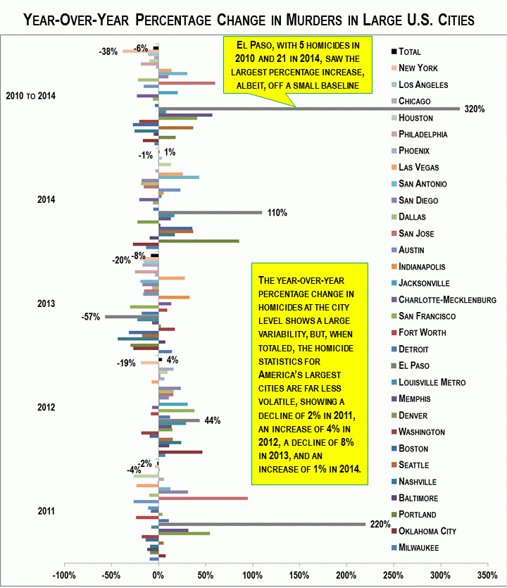
The point of this chart is to illustrate the enormous variation from year-to-year in murders in our major cities. As expected, smaller, safer cities, generally experience far greater volatility in their murder statistics. Again, returning the El Paso, it had the fewest murders of any big city in the 30 city survey, with five murders in 2010. An increase of only one murder would therefore result in an alarming 20 percent increase in murders. This also hints at another statistical challenge from the New York Times piece, that of comparing partial or year-to-date data with the same period the year before. If one measures data from the first eight months of the year, it will, by necessity, be lacking 33 percent of the year’s data, resulting in a much higher probability that the numbers examined will show a wider range of change.
For instance, the New York Times article cited Dallas as a city where, in the first eight months of the year, there were 17 percent more murders than in the same time in 2014, an increase of 12 killings from 71 to 83. But, had the reporters dug into the FBI database, they would have seen that a 17 percent change in the number of murders was quite common, with the number of murders declining in Dallas 10 percent in 2011, rising 16 percent in 2012, declining 7 percent in 2013, and declining again in 2014 by 19 percent for an overall decline of 22 percent from 2010 to 2014. Put another way, the yearly fluctuation in Dallas murders were greater, up or down, in three of four years than the change seen in the first eight months of 2015—alas, data and nuance likely doesn’t attract as many eyeballs as a well-told half-truth.
The bottom line that few Americans know, given the media’s daily drumbeat of shootings and mayhem, is that violent crime in the U.S. peaked in the early 1990s with the gun homicide rate in particular about half today of what it was a little more than 20 years ago.